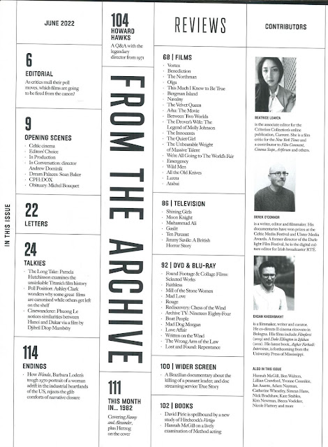
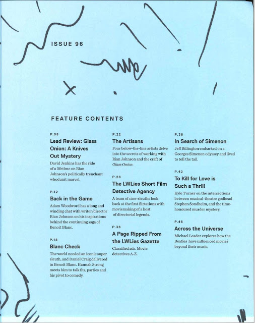
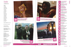
From my analysis of the content pages, I have learnt that they
are usually a set of single pages, except Film Stories, which uses a double
page for each issue. All three magazines use a different composition to display
the contents, but they still follow the same concept. Page numbers are included
in every content page along with a small explanation of what to expect. The
type of content that can be found within the magazine would include reviews, films,
books, endings, and credits. Except for including page numbers with a summary
of what will be discussed, everything else seems to vary depending on the
magazine. For example, images aren’t something that is in every content page as
shown by Little White Lies, who do not have any images. This can also be said
about the use of colour, as Sight and Sound seems to be in black-and-white whereas Film Stories and Little White Lies use a bit of it. However,
all the typography seems to be in sans serif and written vertically but they highlight
different elements. Sight and Sound puts the numbers in a larger and bolder
font, whereas Little White Lies does that for the titles. Film Stories typically
chooses 4 pages to highlight in the centre of the spread, the rest are put to the
right side. Thus, I have figured that the content page doesn't have a strict layout or rules to follow, except for the inclusion of page numbers and descriptions, everything else isn't mandatory.


No comments:
Post a Comment